Curious about the style trends for 2026? The Plants & Flowers Foundation Holland has developed four style trends for 2026, together with Tuinbranche Nederland, iBulb, INretail and Bureau Nijman + Van Haaster. All four are based on the current zeitgeist but are all different. Keep reading to get inspired!
Style trends for 2026
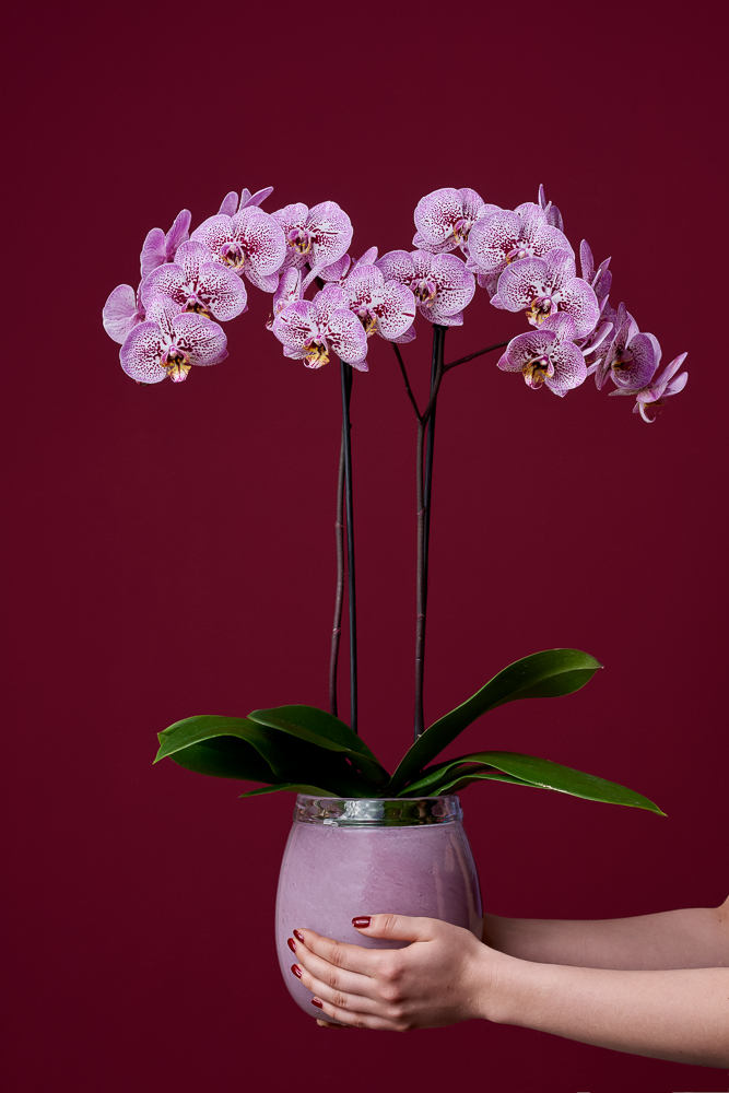
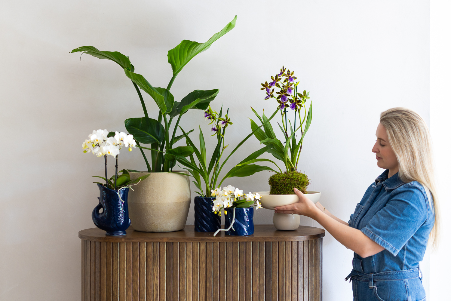
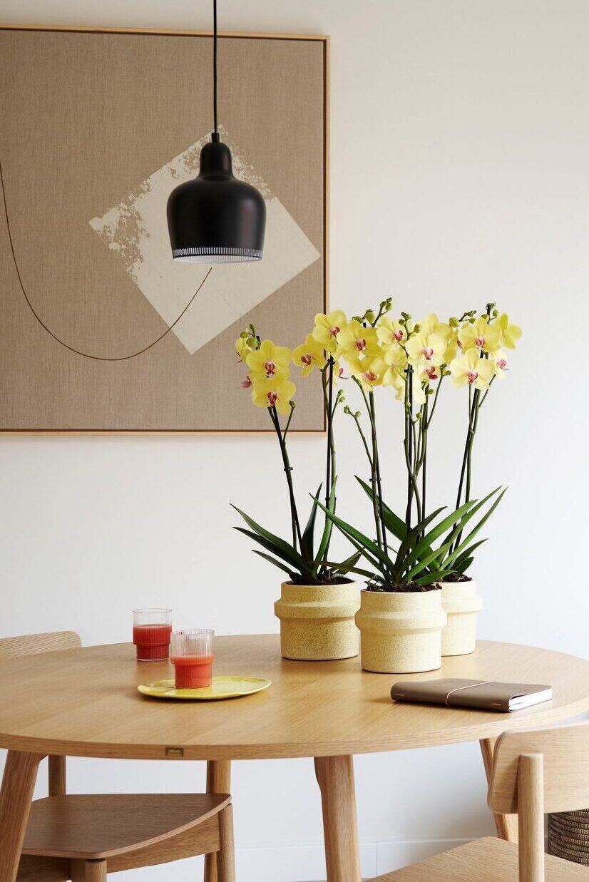
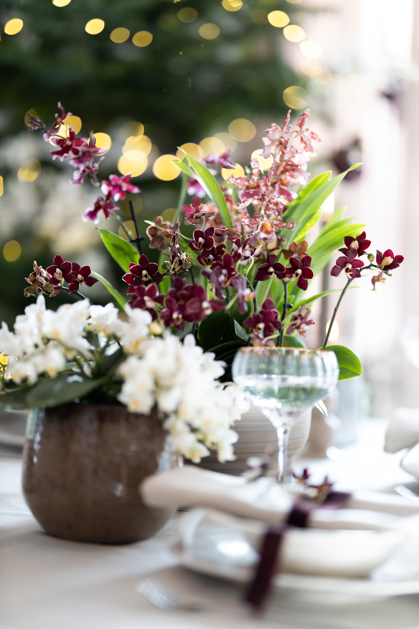
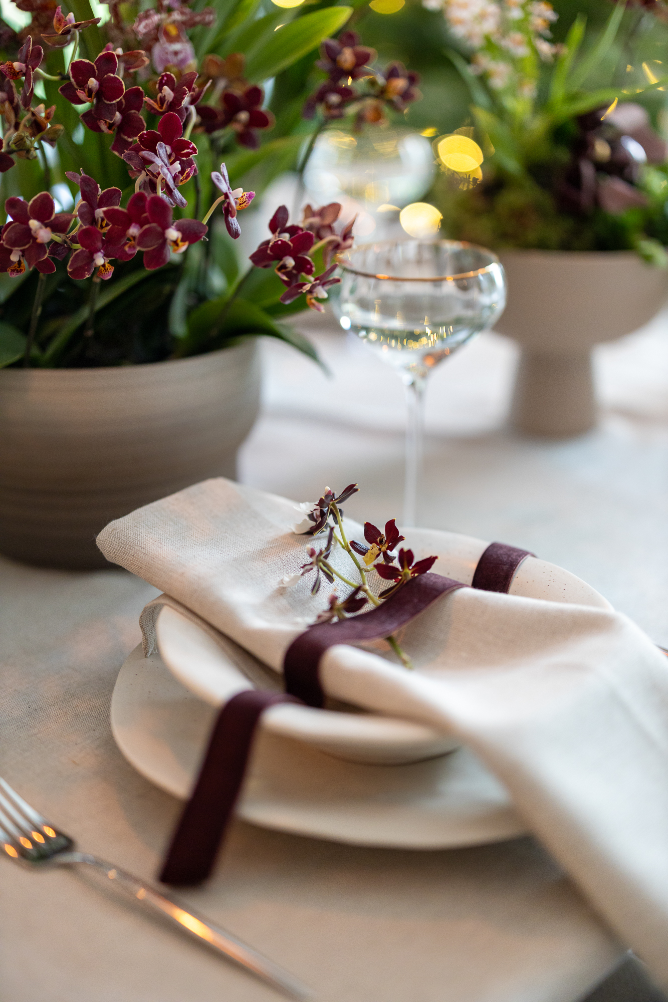
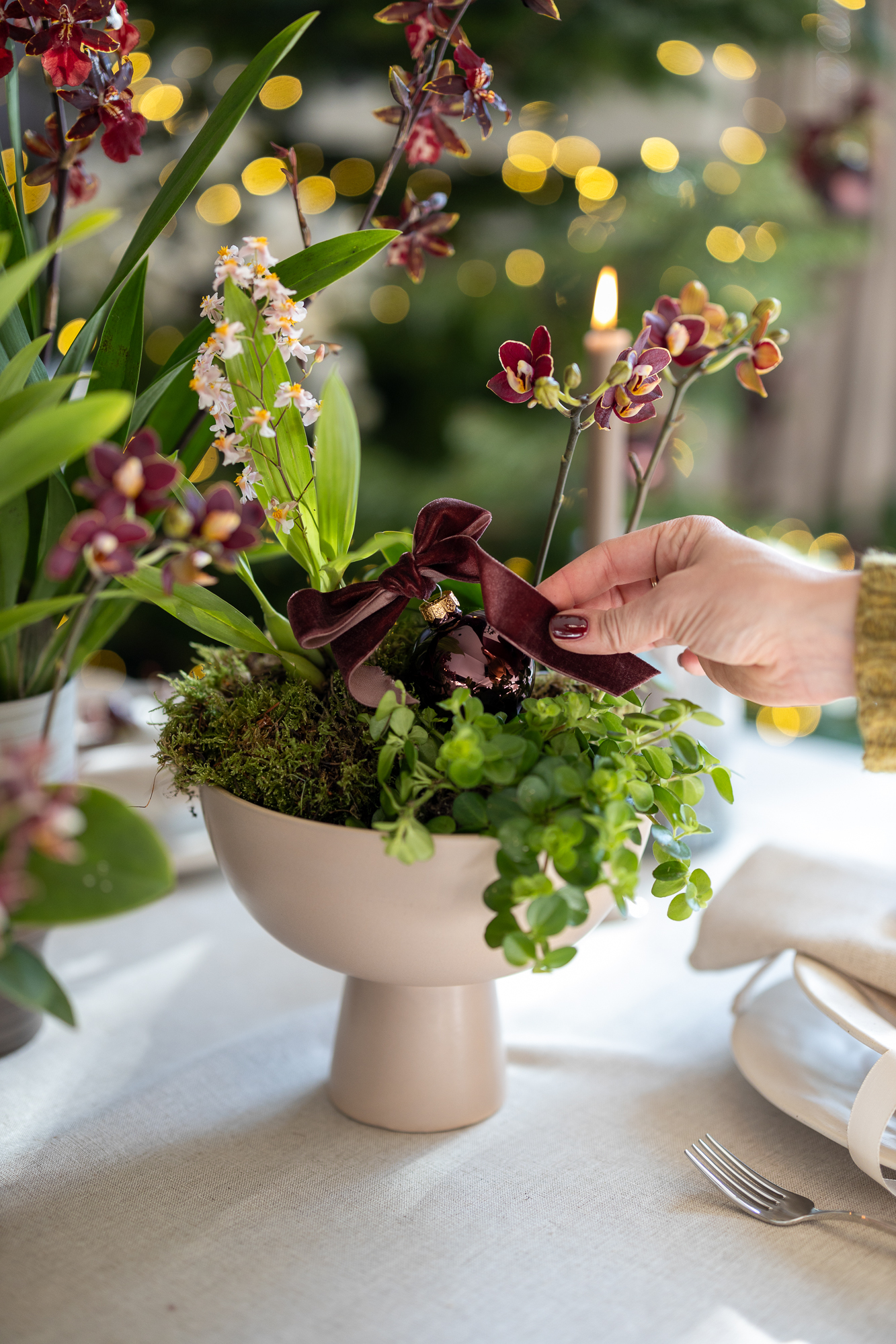
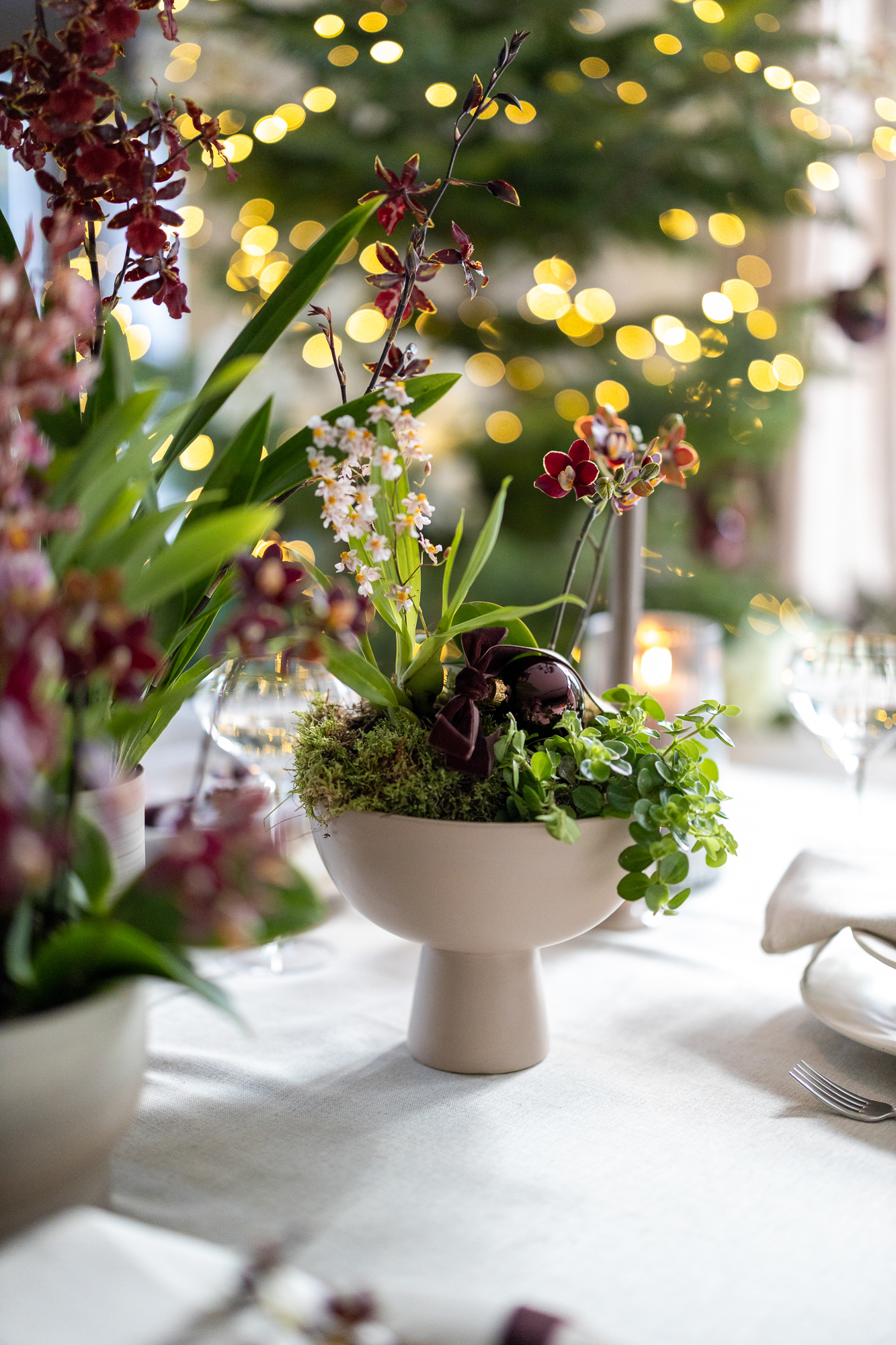
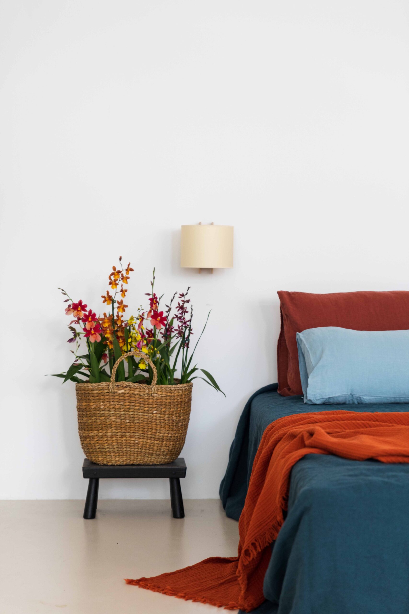
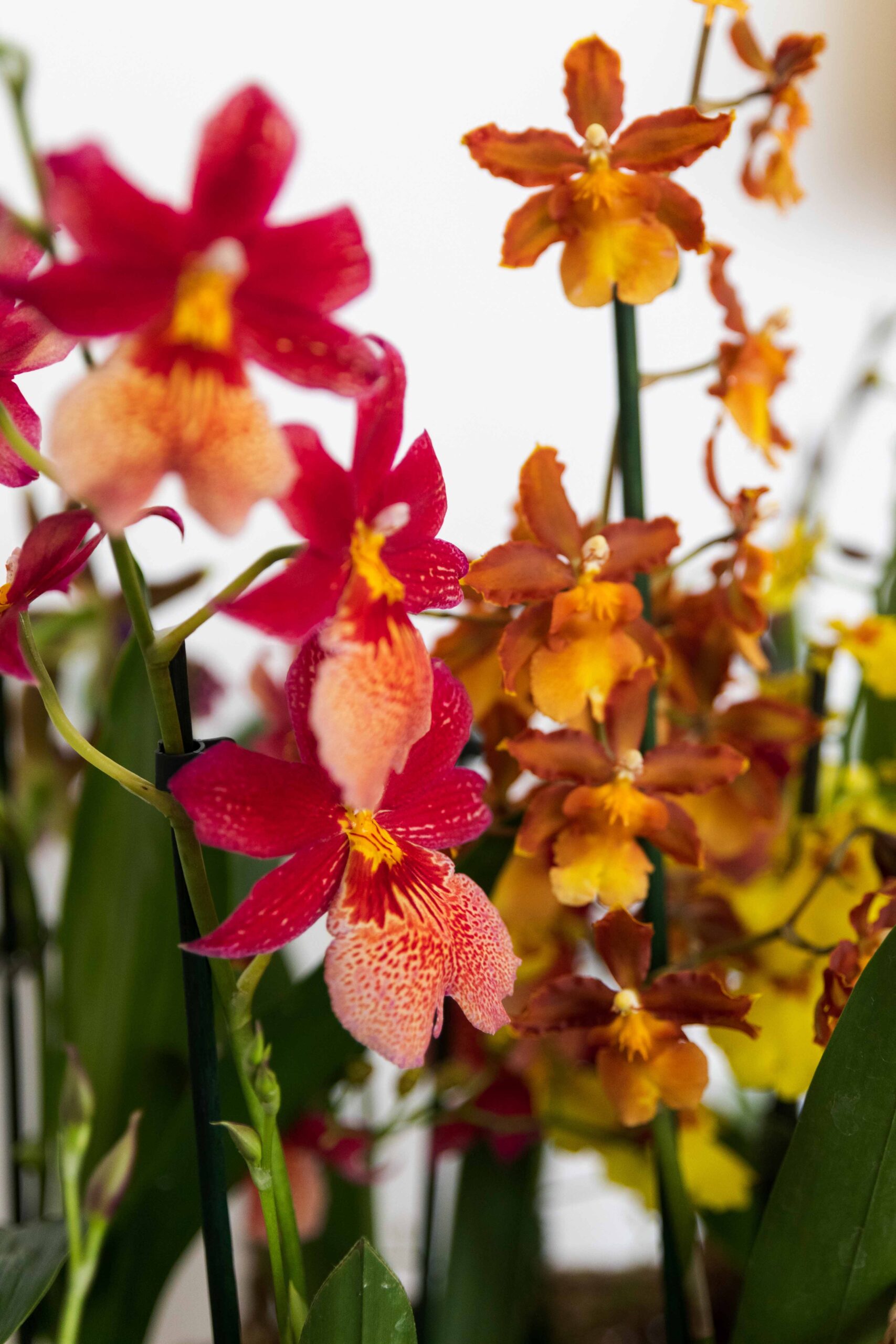
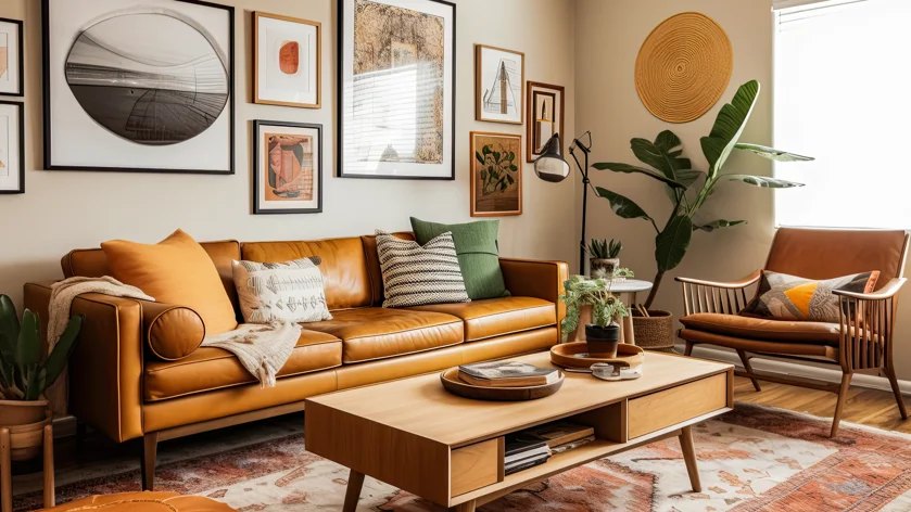
Nostalgic Lens
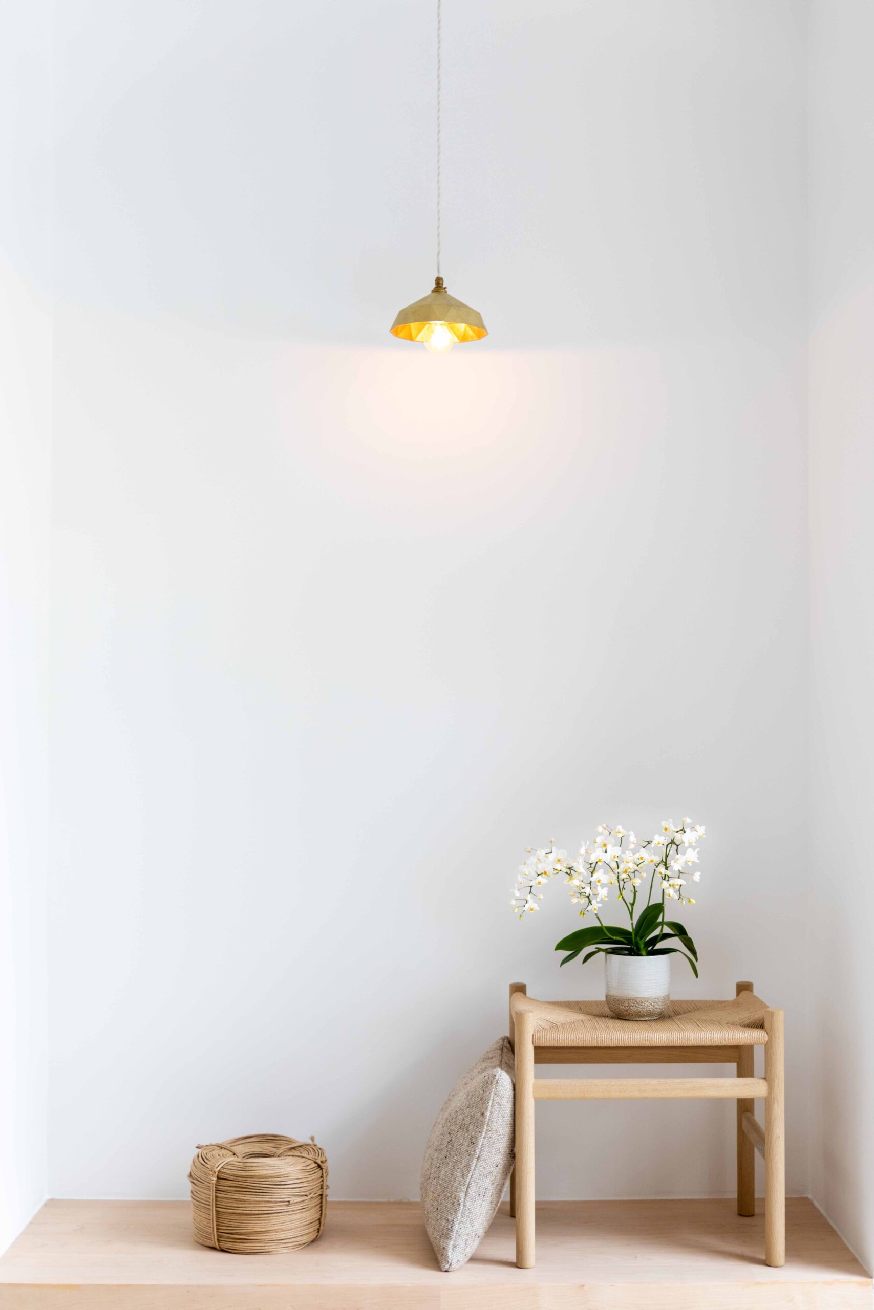
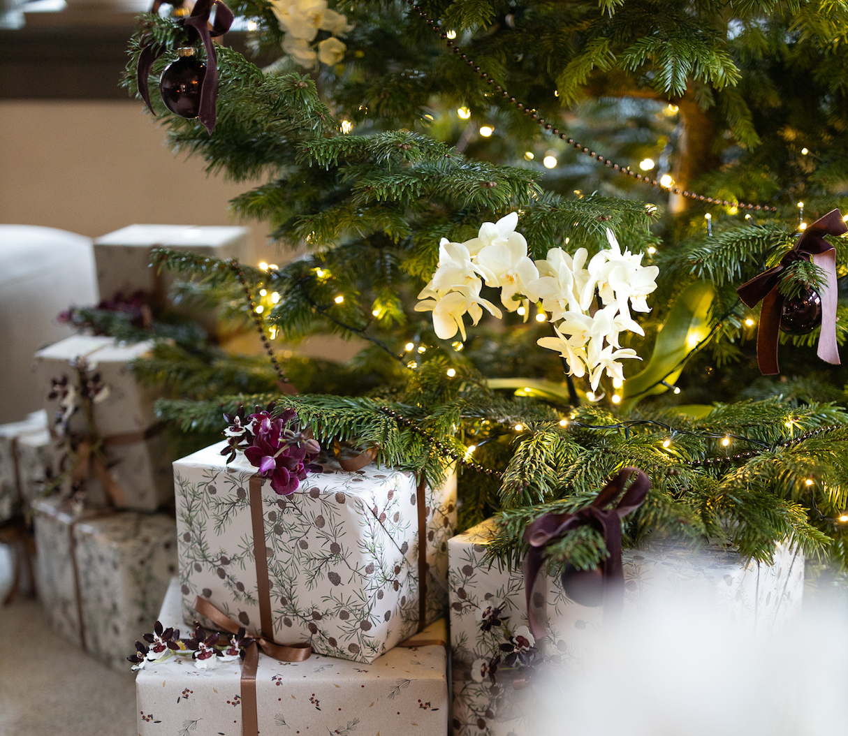
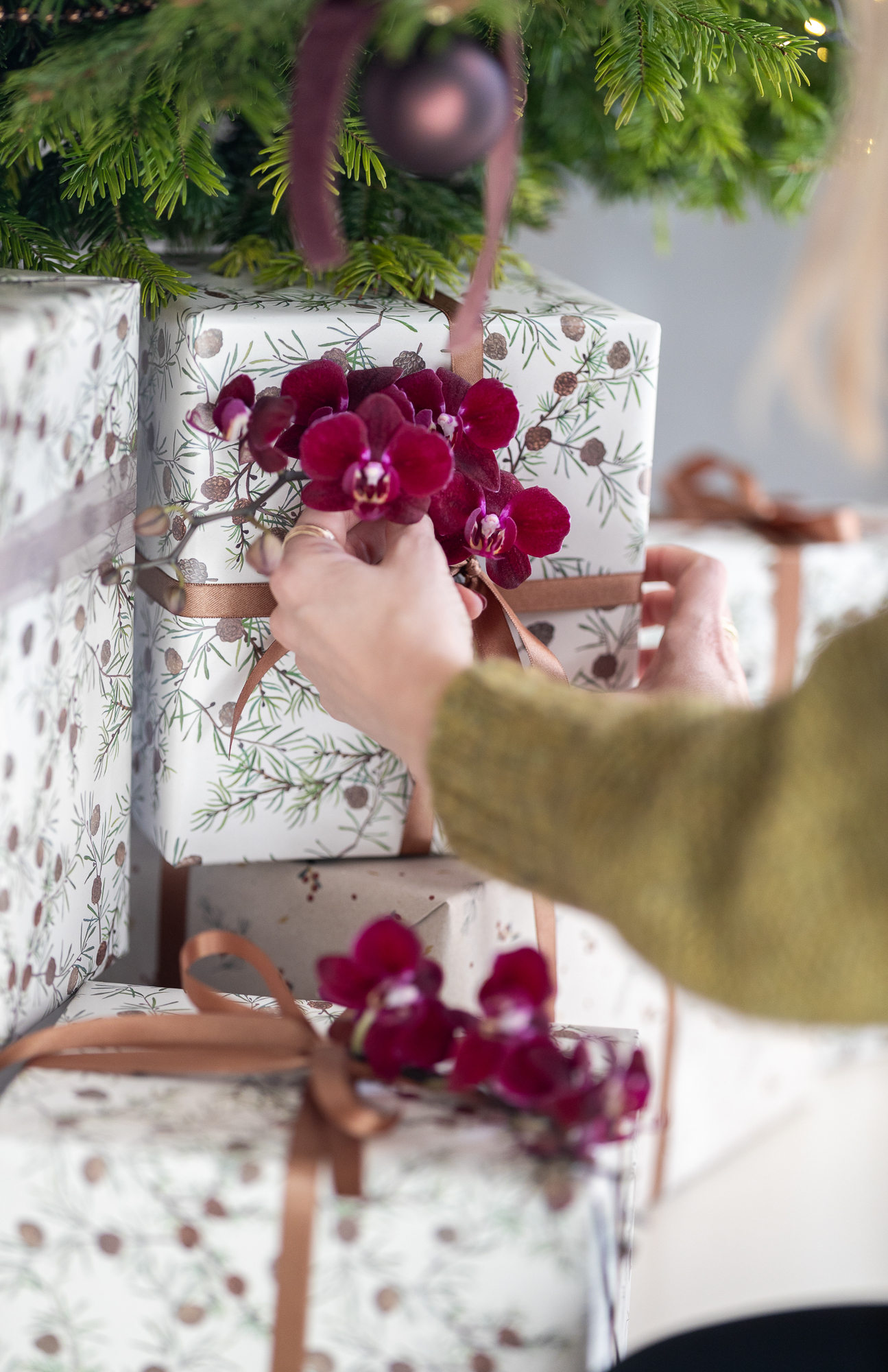
The Nostalgic Lens style trend revolves around uncomplicated times gone by. The cottage style is making a comeback, with a fresh and cheerful twist. Bright pastels, handicrafts, hand-painted ceramics, delicate flowers and checks set the tone. It feels rustic, cosy and homely. Grandma’s kitchen is a major source of inspiration. We see the shapes of dishes, bowls, pans and jugs replicated in other utensils and objects. Pieces of furniture also often have a nostalgic edge. The materials used are ceramics, old glass, enamel, zinc, wood, leather, cotton, linen, raffia and wicker.
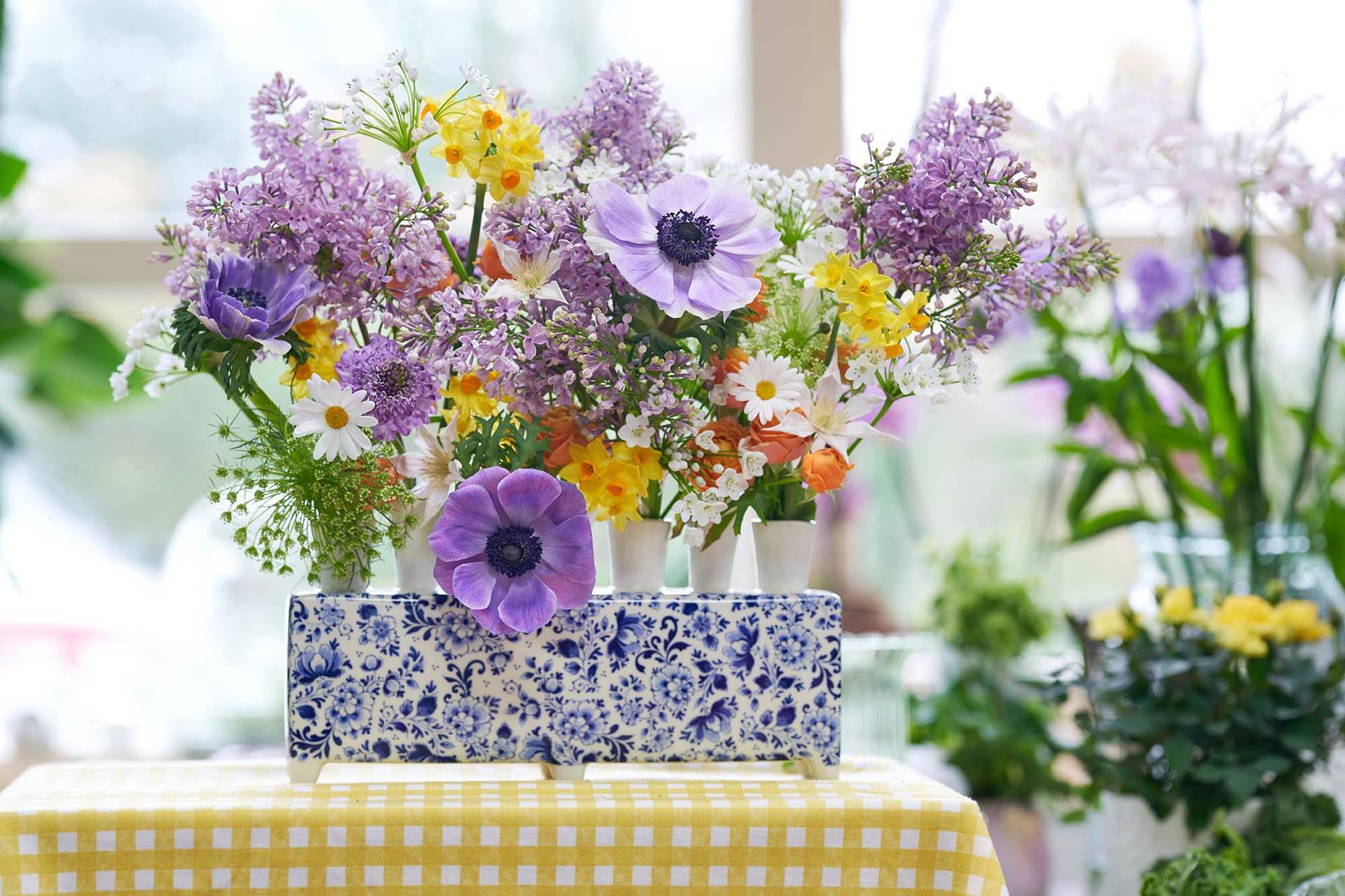
This ‘nostalgia with a twist’ is also reflected in flowers and houseplants. Fruits and vegetables are appearing in arrangements and Biedermeier design is back with a vengeance. Plant lovers are increasingly focusing on small flowering plants and bulbs in pots.
The Nostalgic Lens colour palette consists of white and fresh pastels like pink, purple and mauve. These colours alternate with different shades of green. Bright accent colours like red, orange and blue complete the cheerful and contemporary colour scheme.
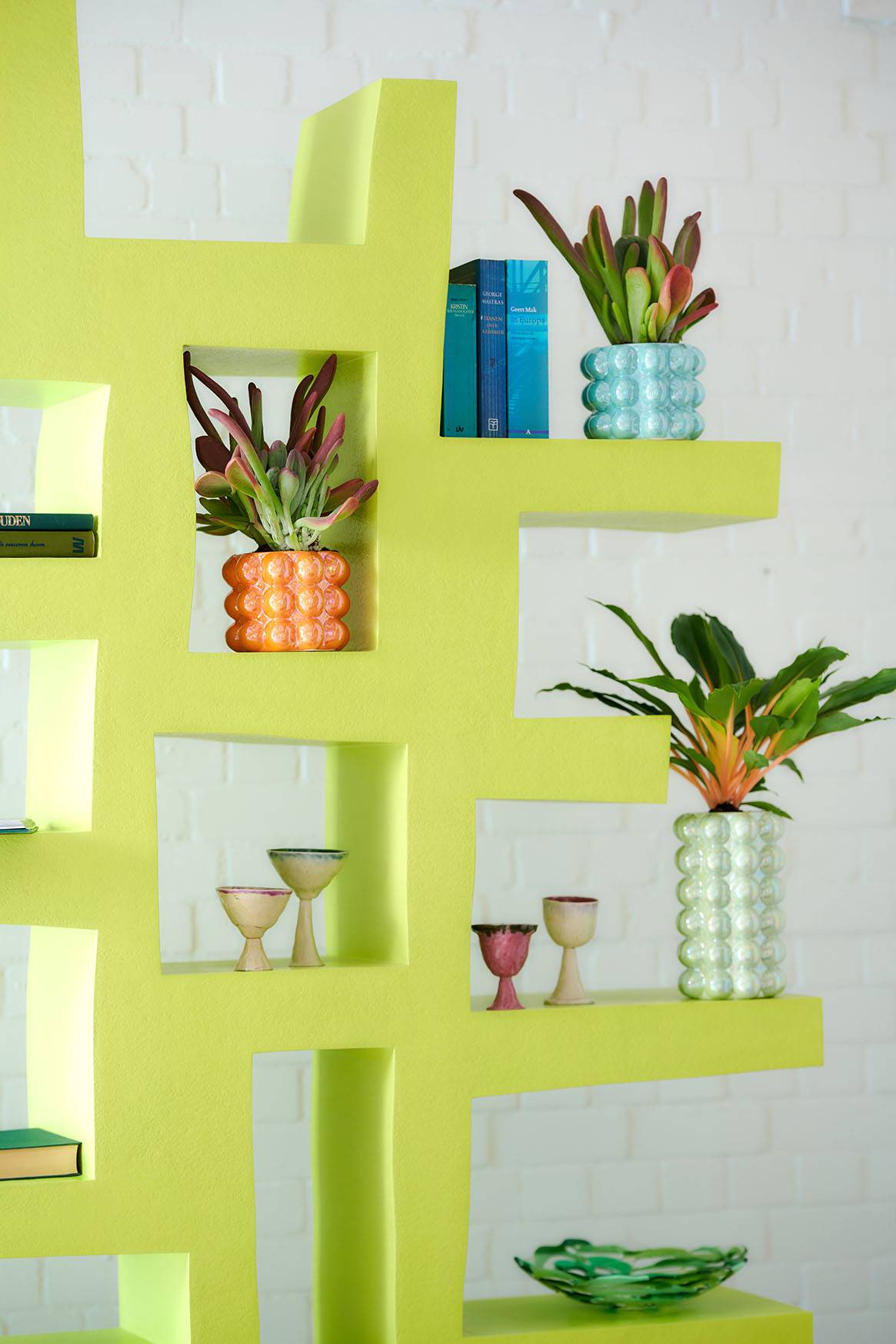
Unexpected Encounter
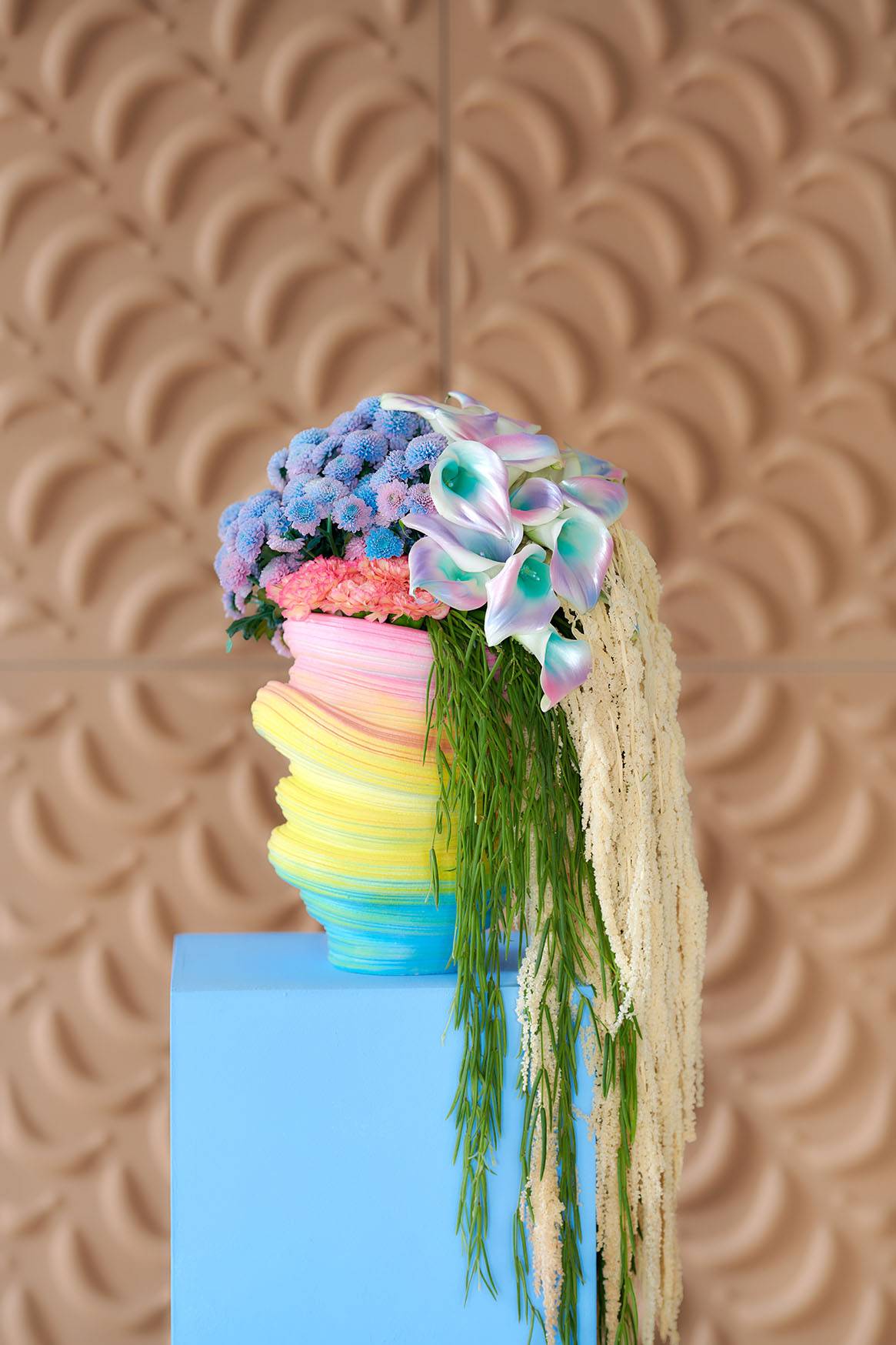
Anything goes – that’s the essence of the Unexpected Encounter style trend. The excitement we seek in everyday life is translated into interiors that reflect an almost fairytale-like world. Eye-catchers play an important role and highly contrasting surrealistic objects are combined. The materials used are full of contrast and unexpected. We are misled, for instance, by materials that seem to be other materials, like ceramics that look like marble. Transparent and semi-transparent objects also make an appearance. In terms of designs, the possibilities are abundant. Figurative designs are often used to create an alienating effect. Dégradé effects are also common. Together, these ingredients result in a surrealistic look & feel.
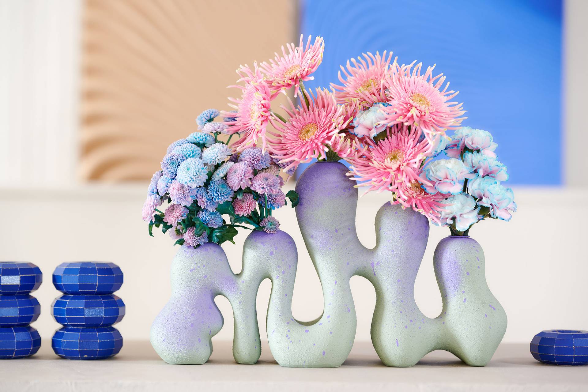
Nothing is what it appears to be and flowers and plants have a magical look & feel. So, don’t be surprised to see a contrasting bouquet of Calla and hanging Amaranthus – or bouquets in sugary pastels that are deceptively sweet. We see the same elusive effect in plants and plant arrangements. Leaves have ‘unusual’ colours like yellow and pink, and we see whimsically contrasting plants. In a nutshell, the arrangements colour outside the lines and tell a story whose meaning is not entirely clear.
Besides shape, colour is the most important product ingredient of this trend. The colour palette consists of extremely bright colours that also appear watery, such as neon pastels in mint green, purple, yellow and orange.
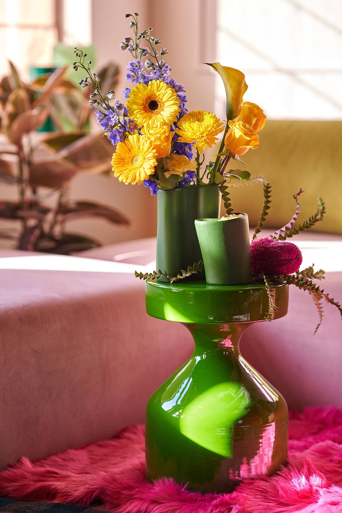
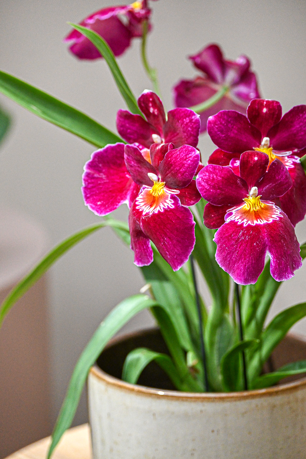
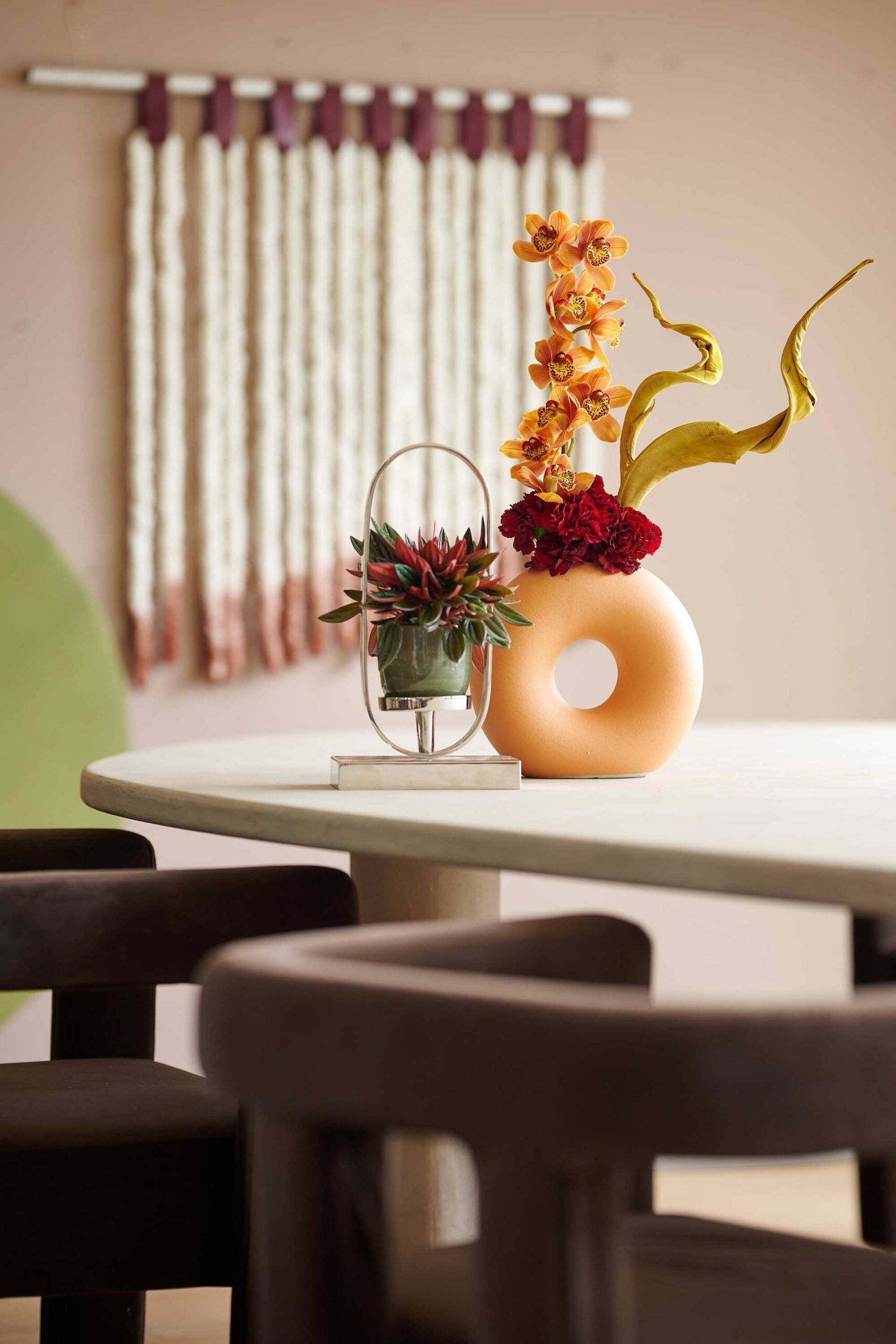
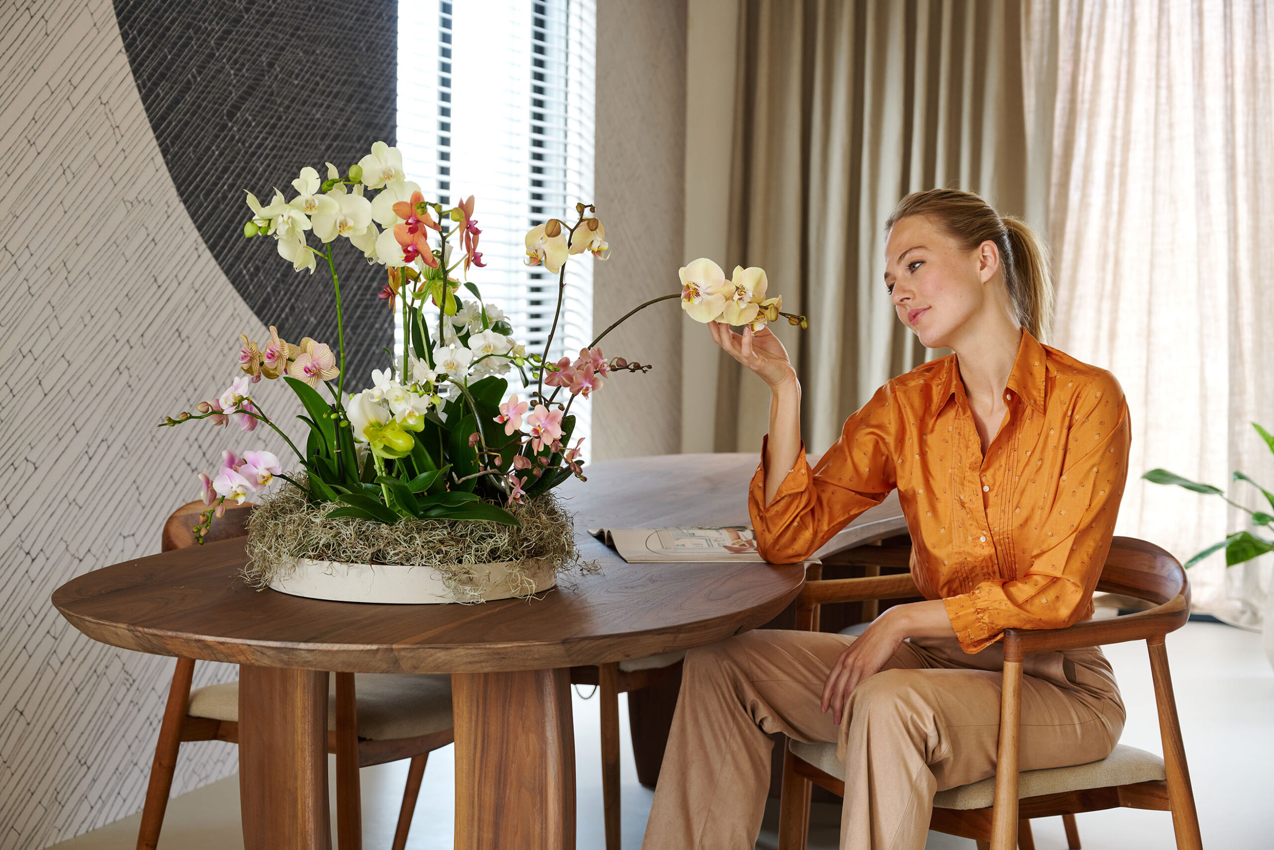
Intriguing Decor
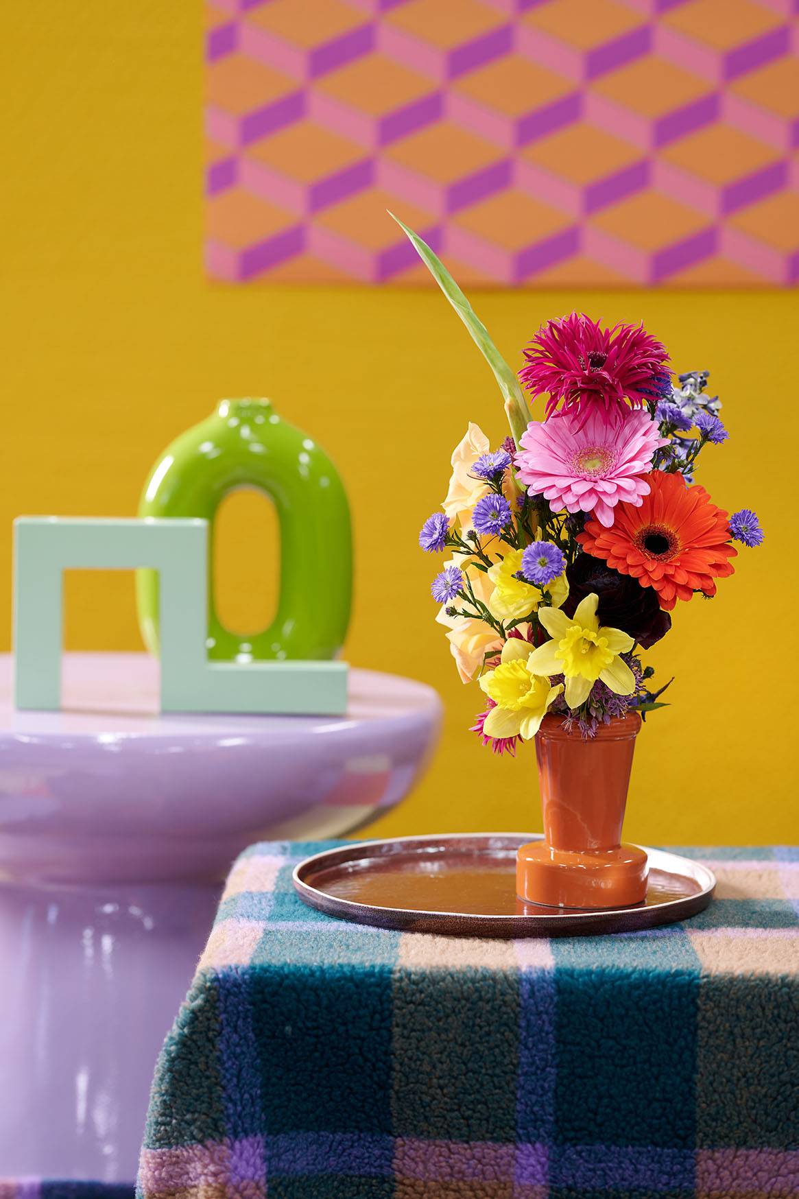
The Intriguing Decor style trend is all about friendliness – creating inviting spaces where you are welcomed by playful designs with rounded shapes. Smooth and glossy objects contrast beautifully with warm, rich colours that appear to embrace you. Soft, large patterned rugs and carpets ensure a comfortable setting. A wide variety of patterns catches the eye, especially checks. Intriguing Decor shapes are rounded and embracing, with a snug, homely feel. To keep things visually interesting, they are alternated with clean lines and smooth surfaces. Materials with a warm, friendly touch dominate: braided cord, bouclé, wood, glazed ceramics, velvet, irregular glass and carpets with a short to medium pile. Patterns range from checks to smudges and textured motifs.
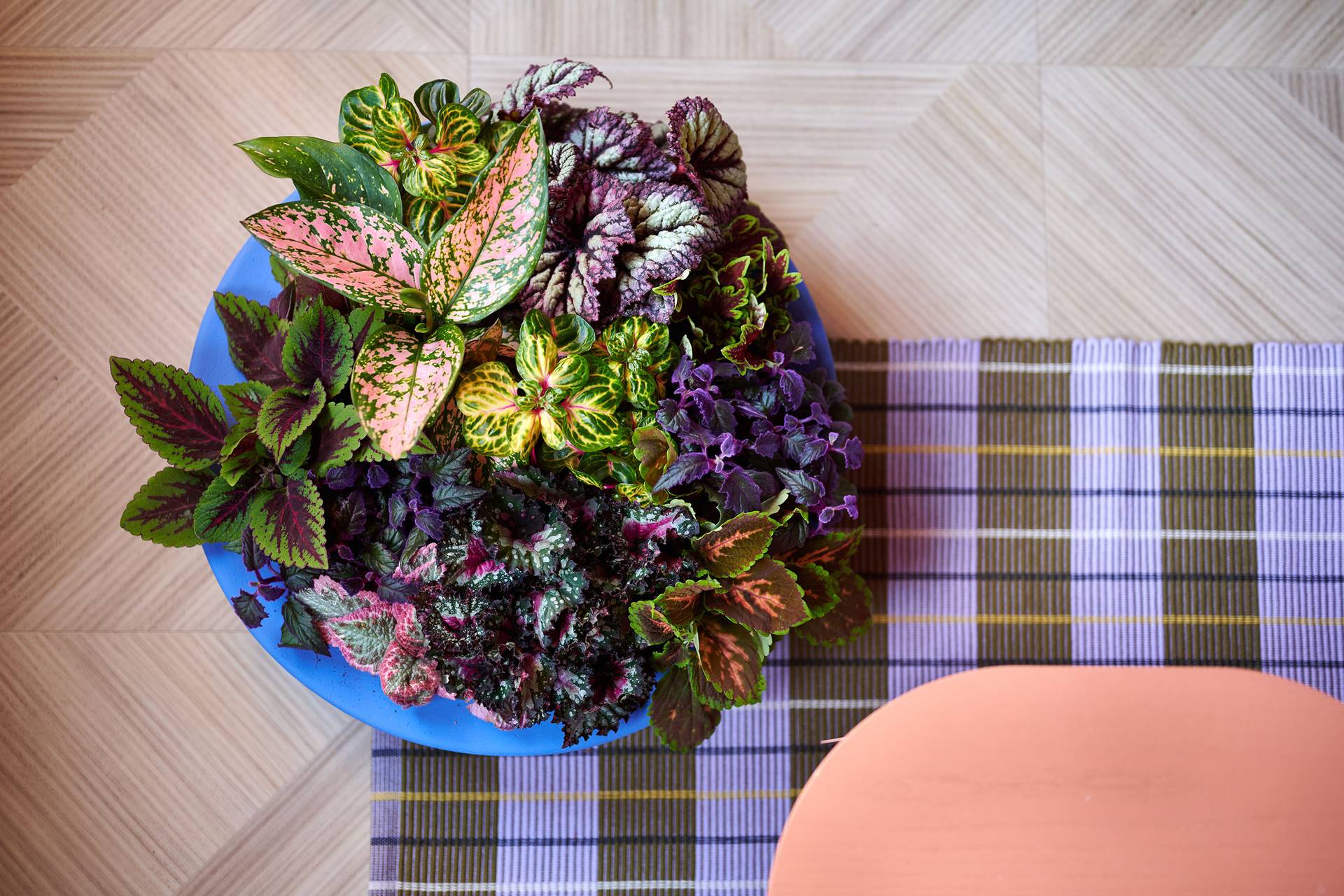
Bouquets are mostly colourful and often have an unruly shape and different heights. Monochromatic bouquets, i.e. with different flowers all in the same colour, also attract one’s attention. With plants, exciting leaf colours play a major role, like those of Cordyline, Croton, Coleus and Gynura.
The Intriguing Decor colour scheme revolves around exciting colour combinations: light/dark, cool/warm – anything is possible. We see powerful and warm colours like aubergine and russet alternating with shades of pink and green, as well as exceptions like pale yellow and bluish purple.
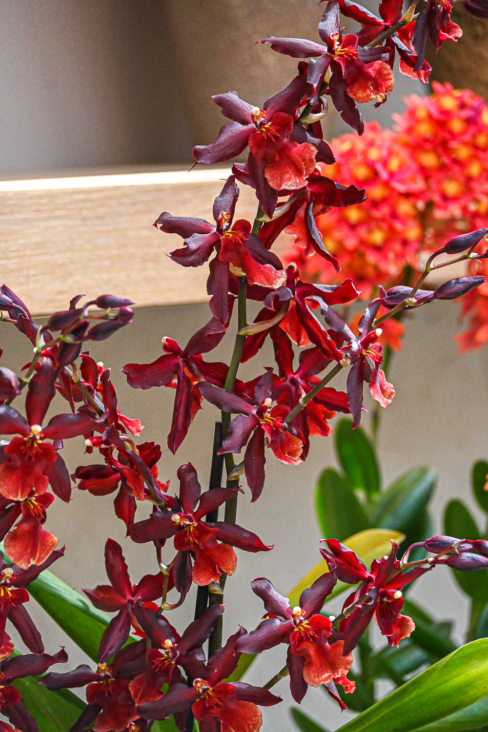
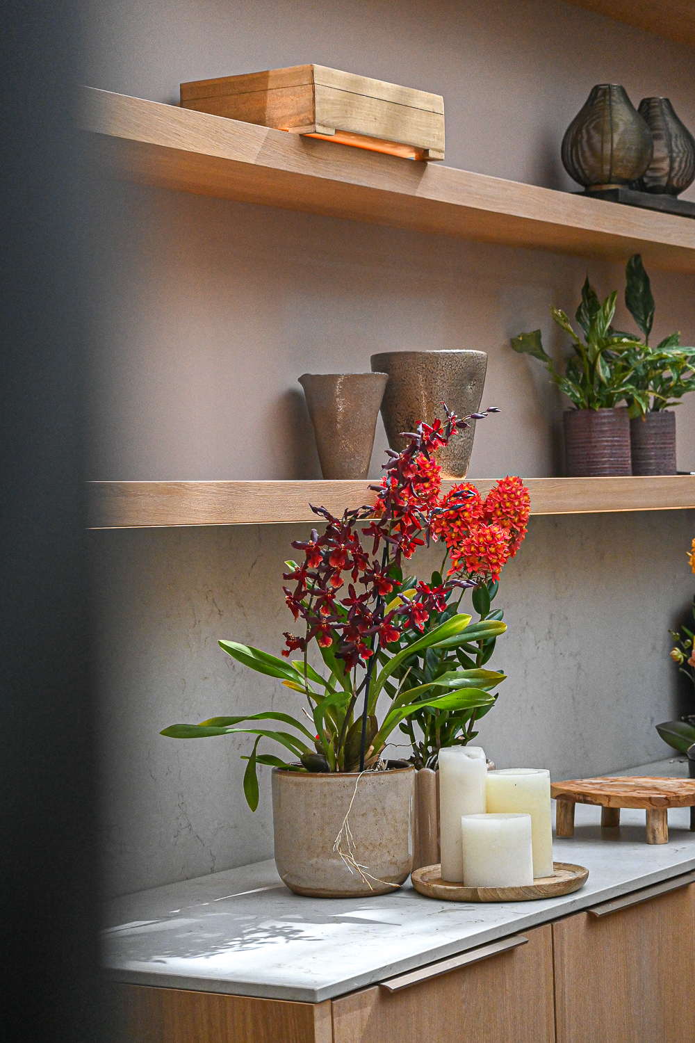
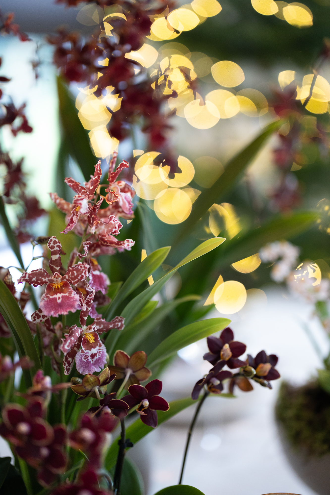
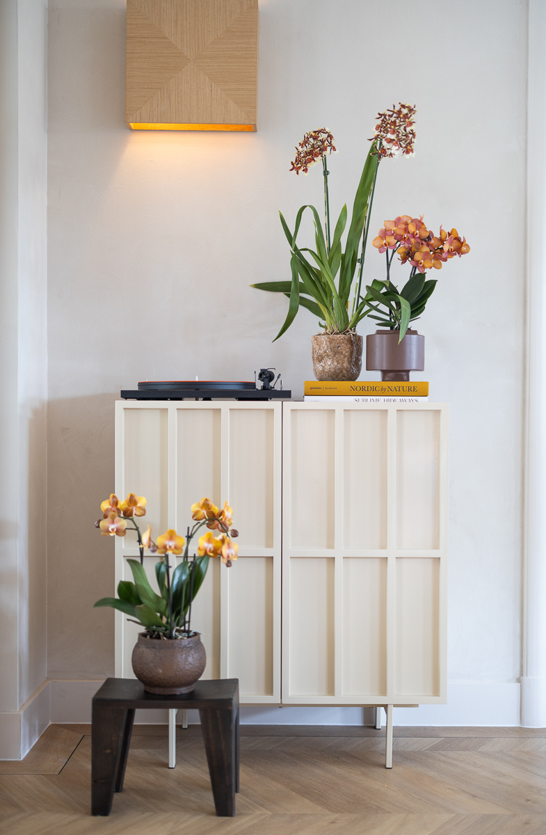
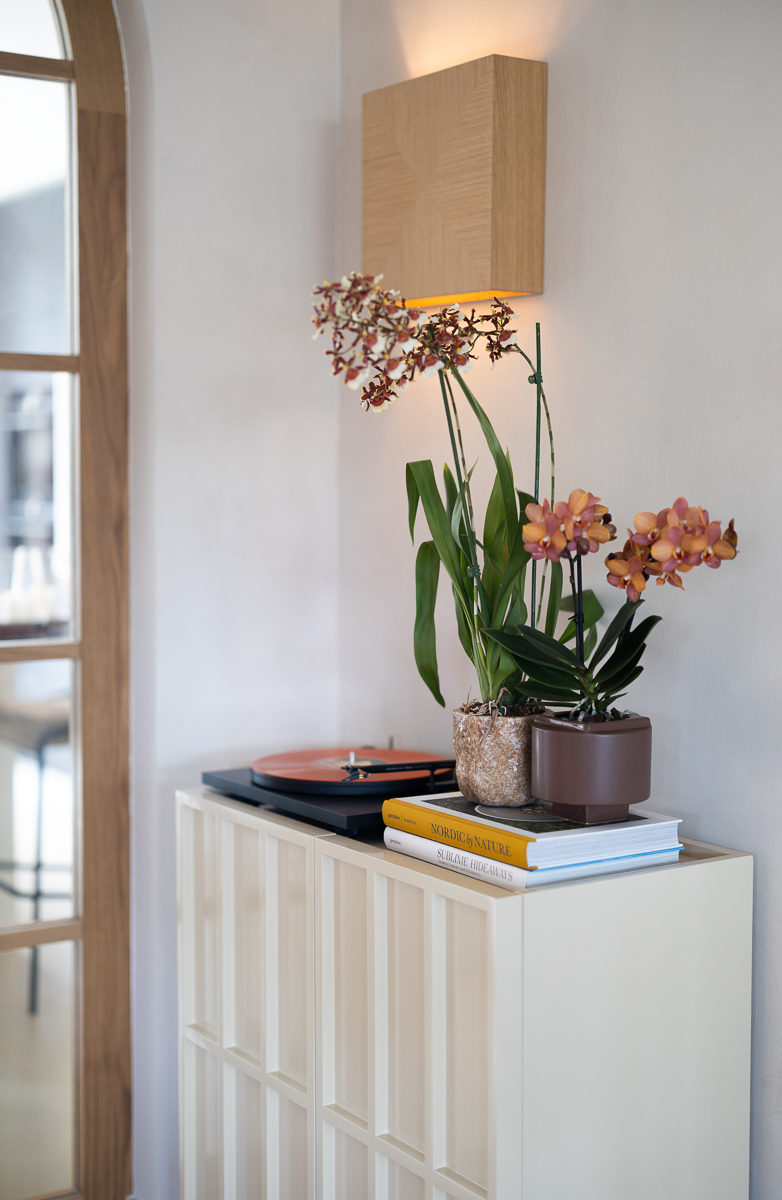
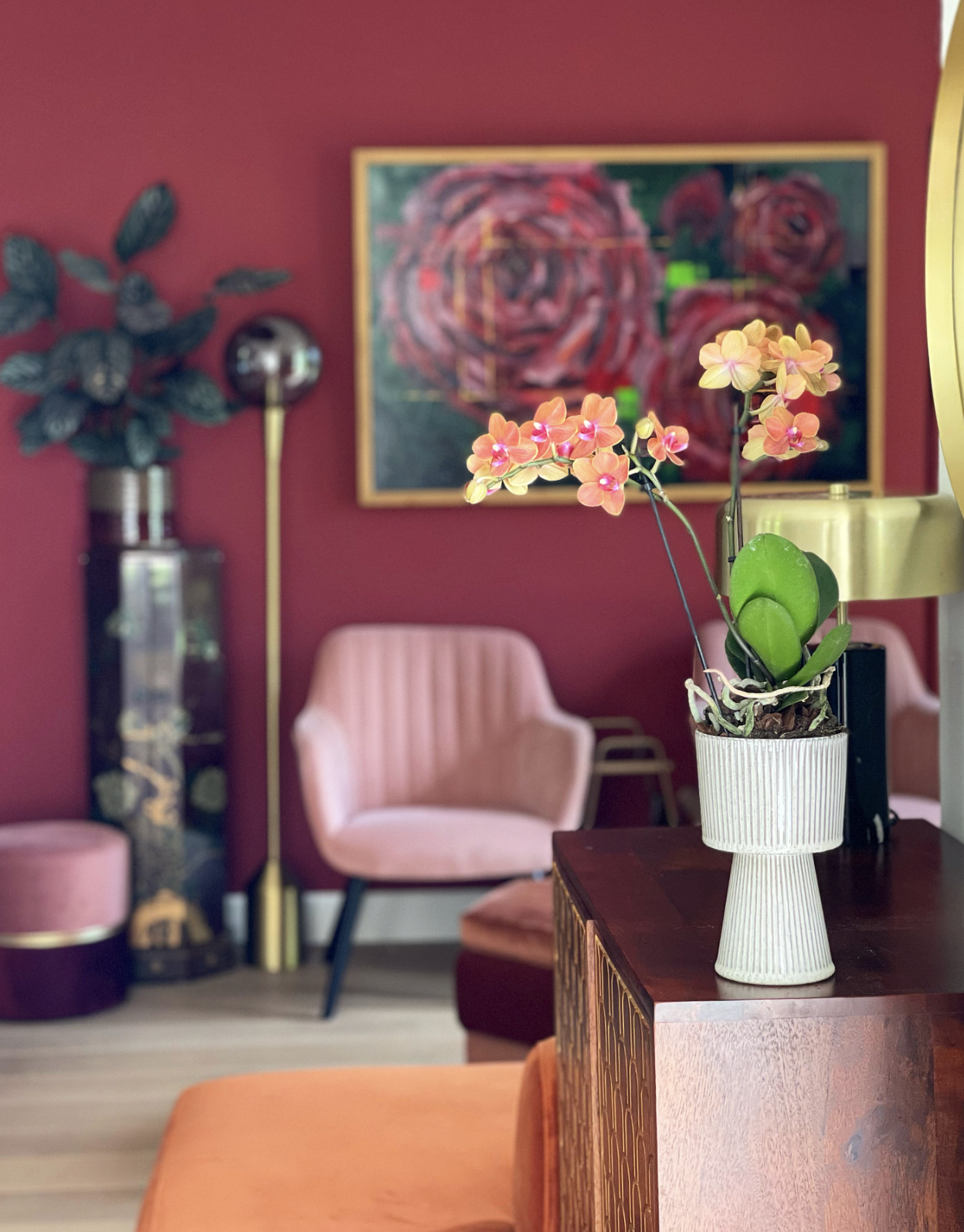
Orbit Revive
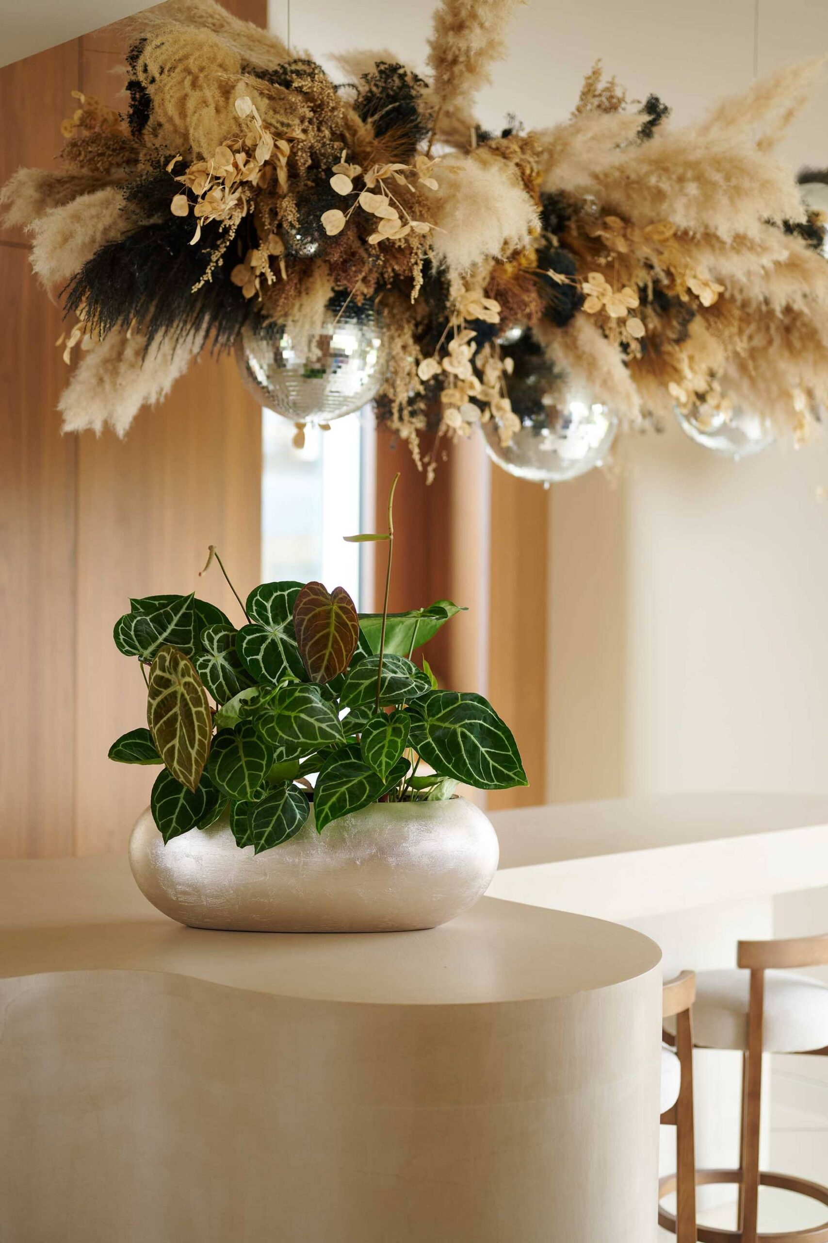
The Orbit Revive style trend focuses on the consequences of advancing technology. Just as in the ’60s, ’70s and ’80s, we find ourselves on the eve of technological breakthroughs. This gives us a sense of looking into the past as well as the future. This ‘vintage futurism’ can be seen in interiors in a combination of retro Space Age and modern organic design. Iconic design classics have returned and James Bond himself seems to have had a hand in the decadent, luxury interiors. Round shapes, fluffy textures and a touch of metallic all stand out. Materials are varied, but many items have an industrial look. Shiny surfaces and chrome are also frequent features. Patterns include geometric block compositions, dégradé effects and organic blot shapes.
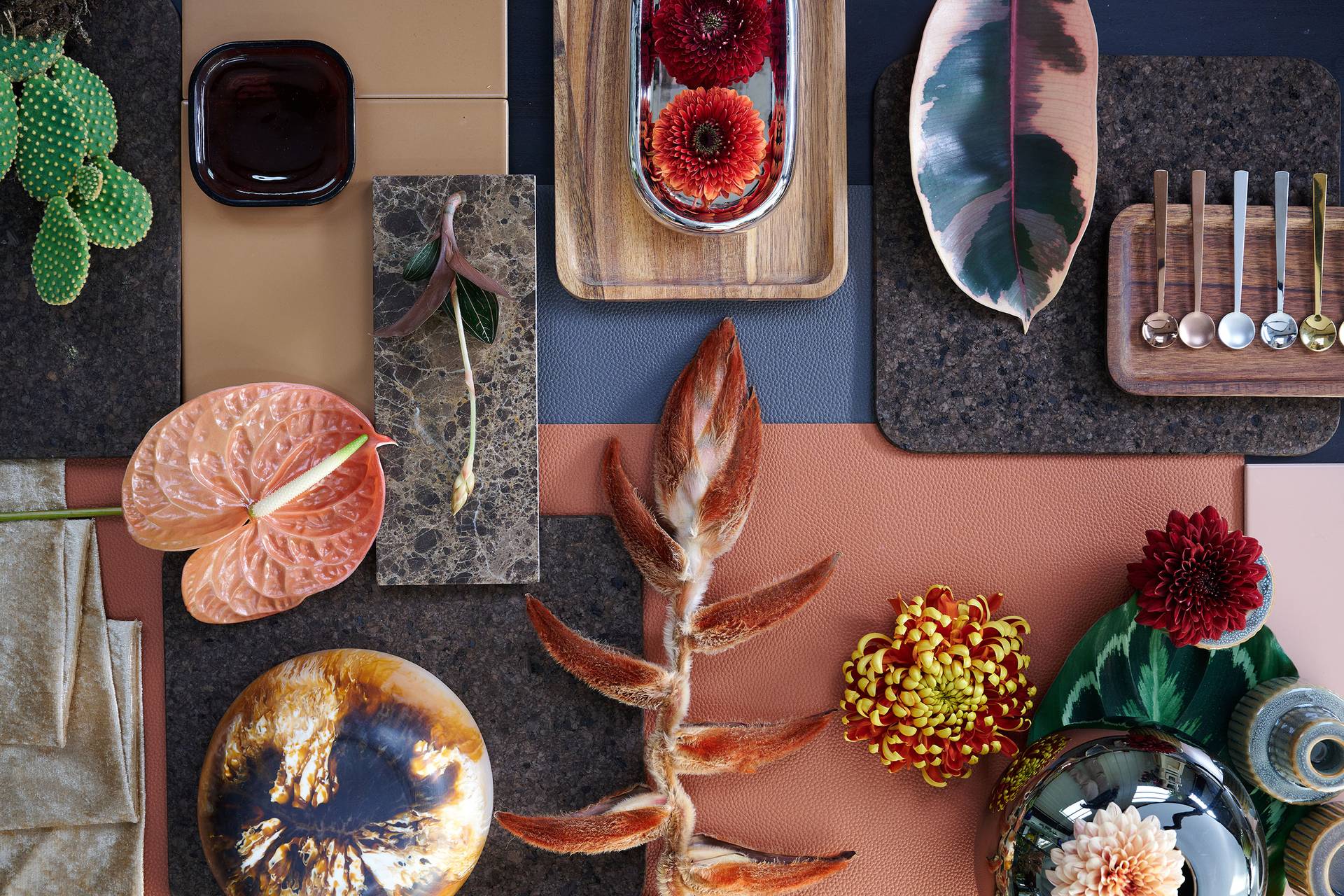
In terms of flowers and plants, the ‘80s are the main source of inspiration. This means bouquets that are one-sided, with a clear height difference. This trend also includes dried flower arrangements. Plants often have colourful, dark or shiny leaves. Botanicals are combined with various leaf colours in plant dishes.
This colour palette is dominated by natural shades, from light nudes to warm brown. Various shades of green, from yellowish green to olive green, offer a fresh contrast. Colours like deep pinkish red, orange, silver and chrome provide a surprising accent.