This is the Dulux Colour of the Year 2025: True Joy

Curious about the Colour of the Year 2025? According to Dulux, it’s True Joy: an uplifting yellow that fills your home with optimism, pride and a pop of colour. A bold colour that brings change. Dulux describes this trend colour as one that invites you to move forward, embrace the new, and fill your home with joy and inspiration. And who wouldn’t want that? Eager to find out how to incorporate the Dulux Colour of the Year 2025 into your interior? Read on for inspiration with True Joy.

Also read: How to brighten up your hallway with orchids


Dulux Colour of the Year 2025

True Joy is a warm, sunny shade that effortlessly fills any space with creative energy and positivity. It’s a yellow that works brilliantly on its own, adding optimism and warmth to any living room. But it also works beautifully as a striking accent colour to complement other shades. We’ll show you some examples!


True Joy inspiration

The most obvious choice, of course, is to paint an entire wall yellow. Completely on-trend, but perhaps a bit too bold? In that case, you can opt to paint part of the wall, as shown in the photo below.


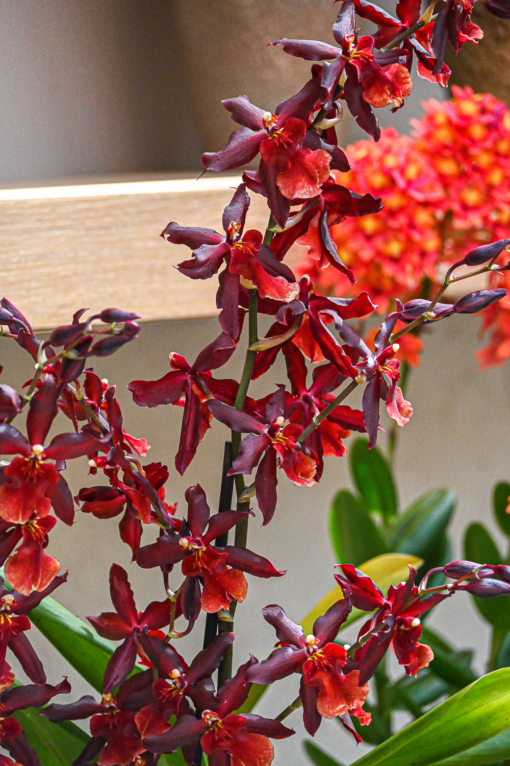
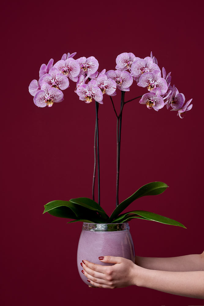
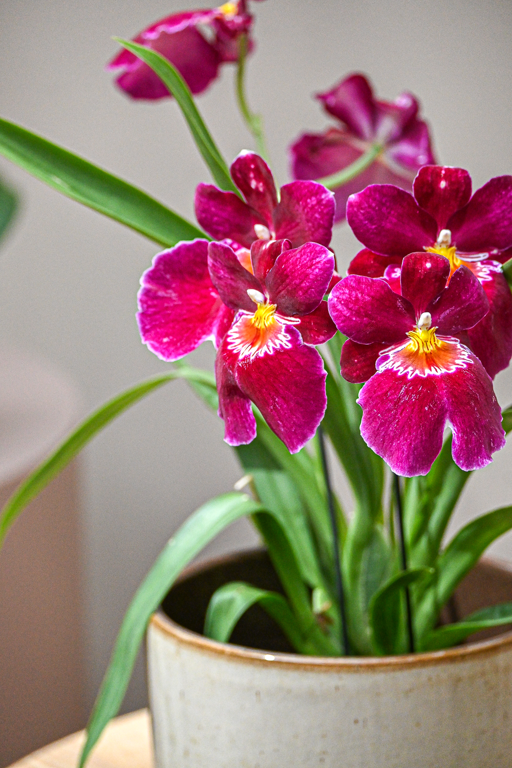
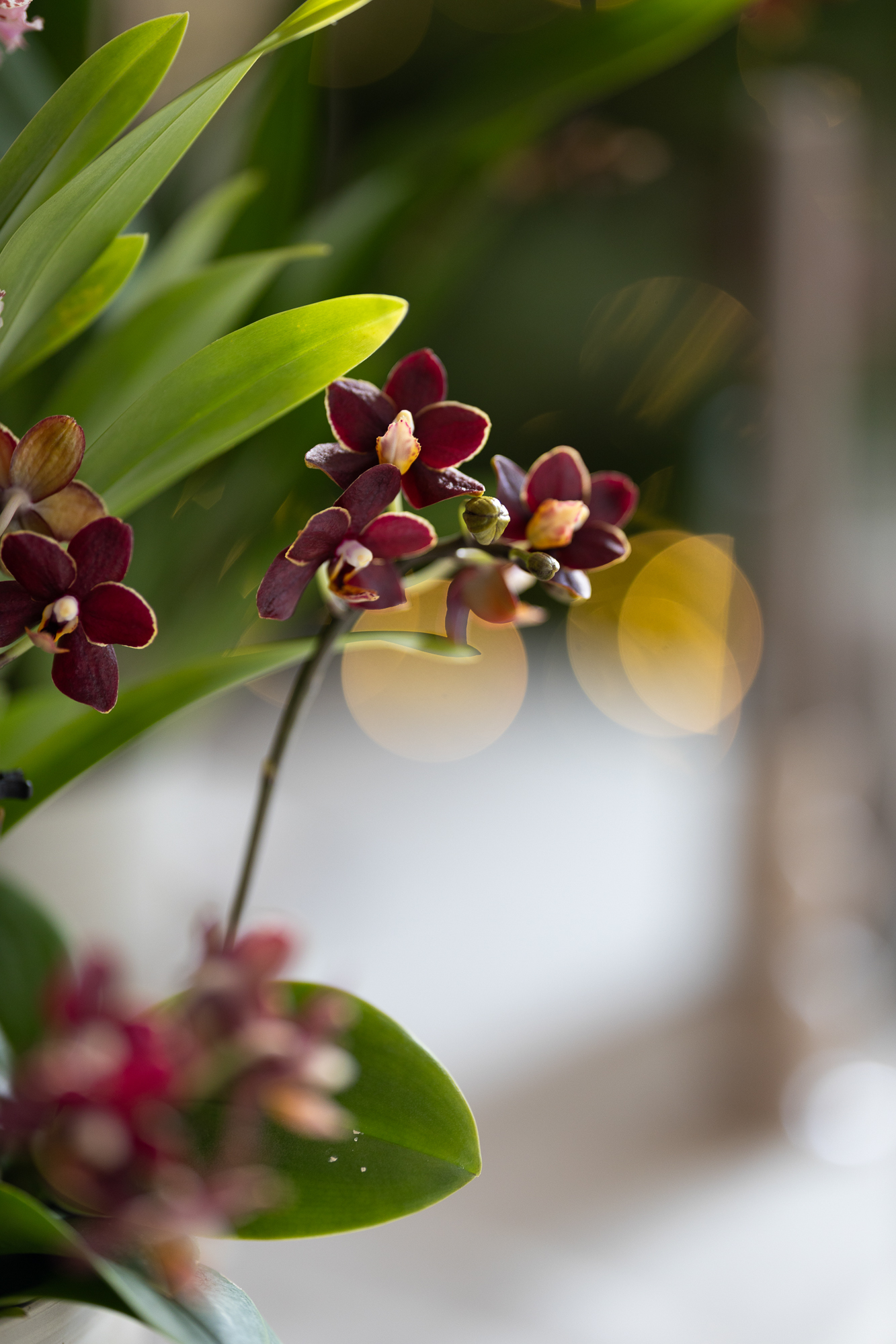
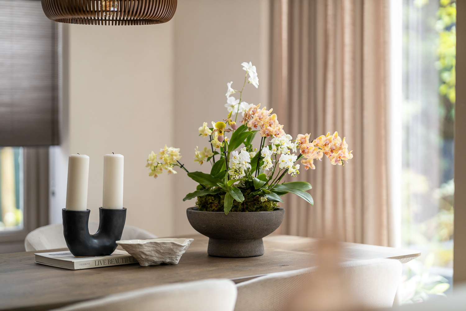
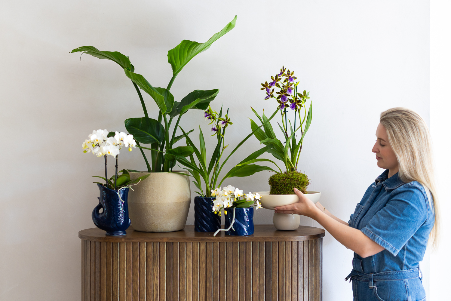
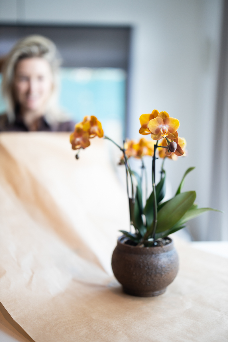
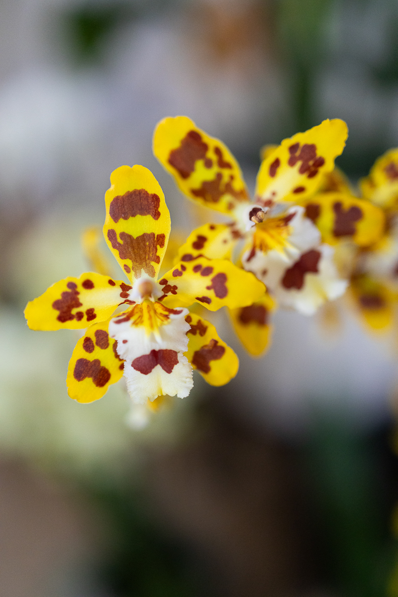
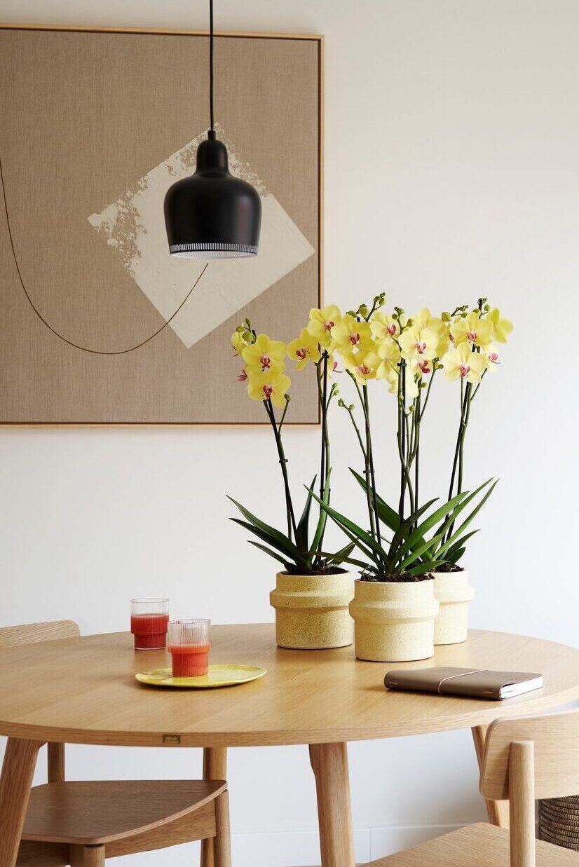
You can also start with a small yellow addition, such as a few striking accessories. For instance, there are different types of orchids available in the colour yellow! Regardless of the weather outside, they bring a bit of sunshine indoors.


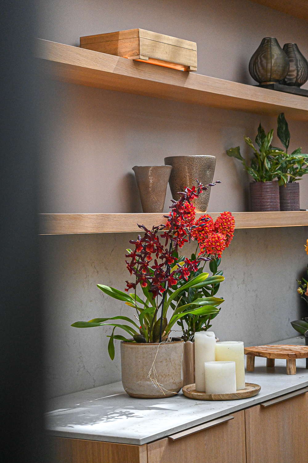
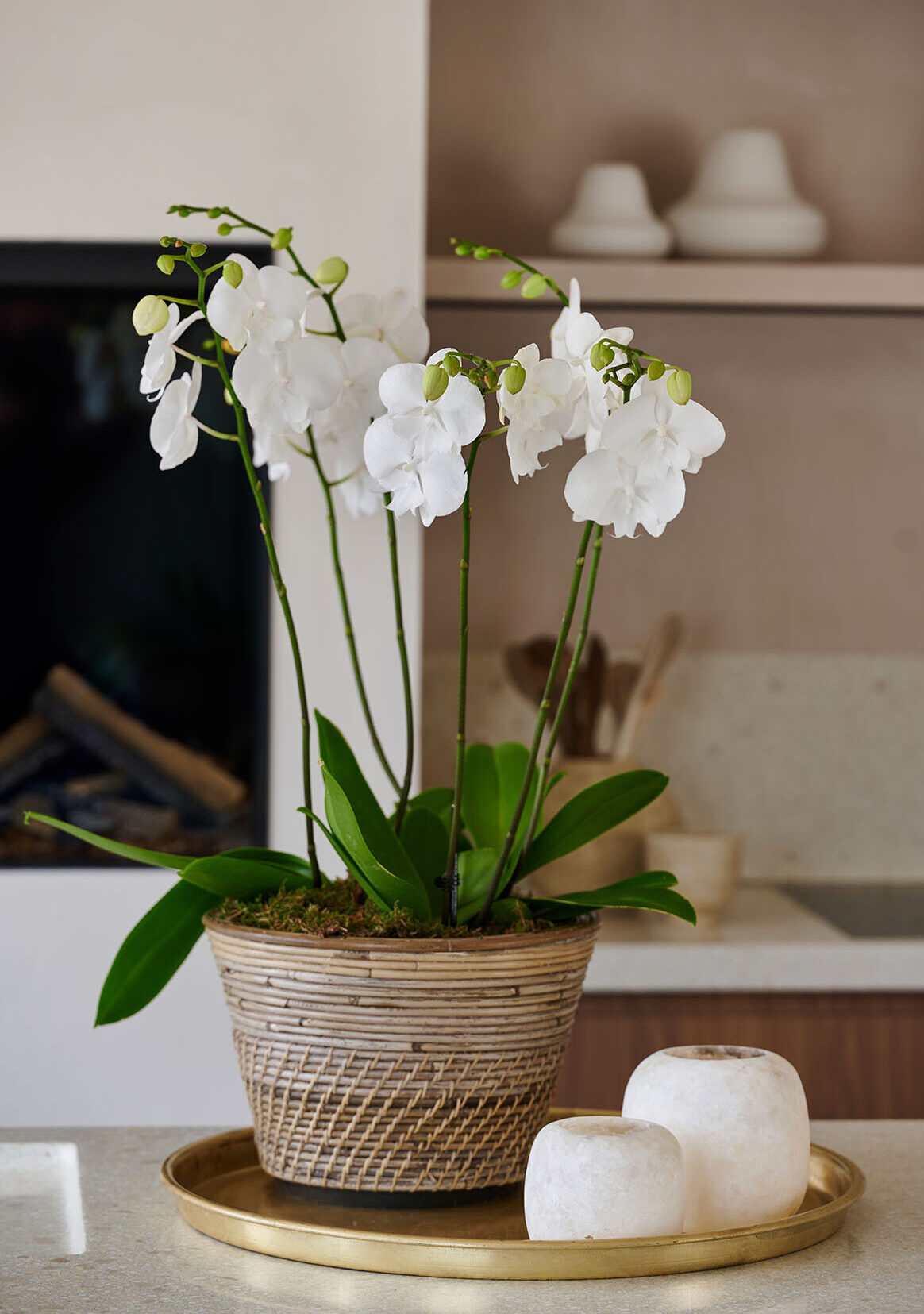
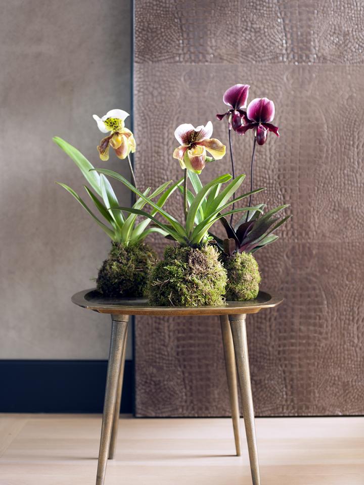
Prefer a more subtle approach? Yellow also pairs beautifully with natural materials and colours like beige and brown. This way, you can bring True Joy into your home without it being too overpowering.


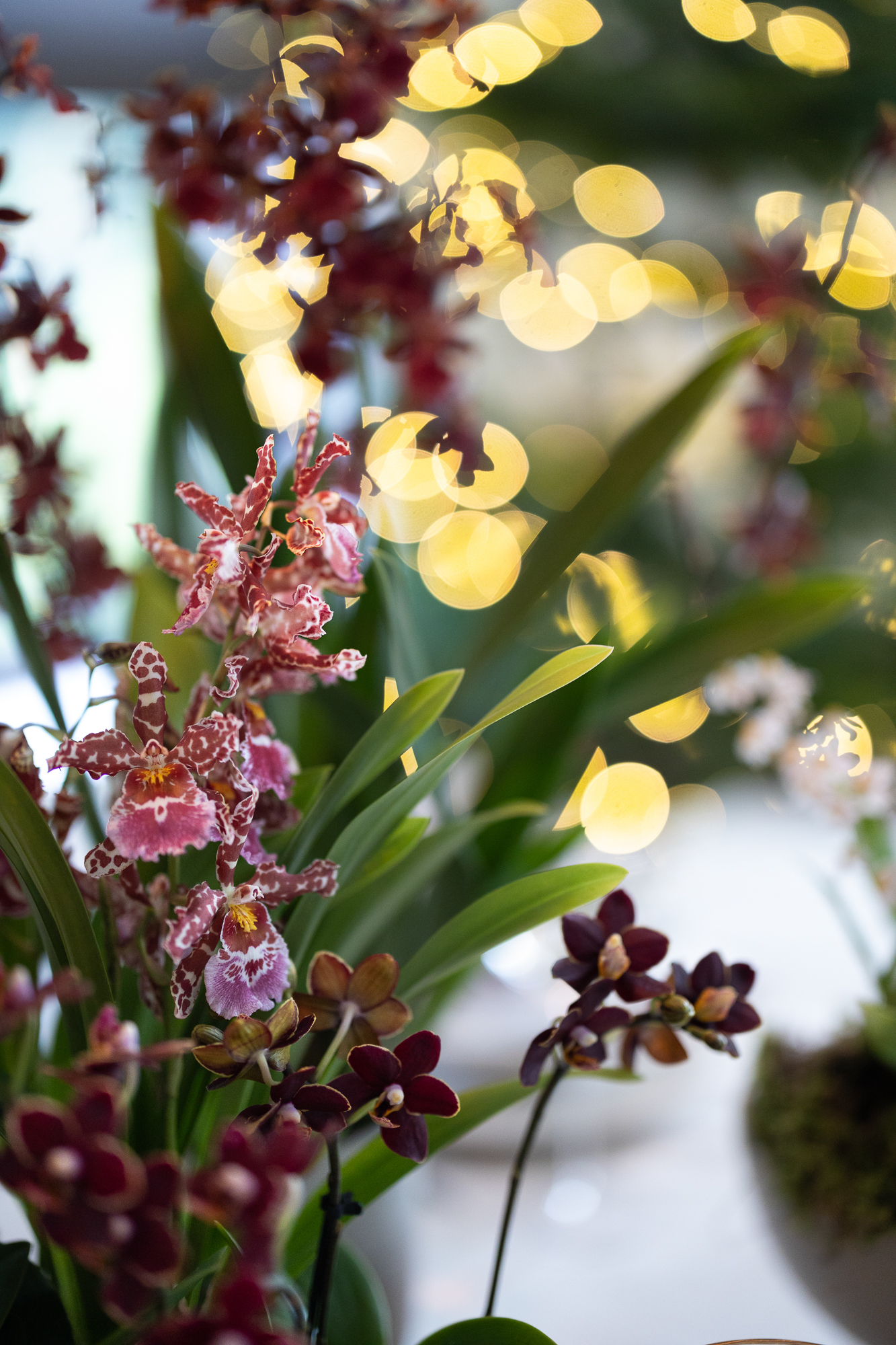
Or create a lovely plant arrangement with yellow, white, and pink orchids! A beautiful winter scene.


Kerstboom eruit, kamerplant erin


Also read: How to bring natural design into your interior this autumn

This is Peach Fuzz: Pantone’s Colour of the Year for 2024

Peach Fuzz is the colour we’re going to see a lot of this year, as it has been chosen by Pantone as the Colour of the Year 2024! It’s a velvety, soft peach colour that enriches the heart, body, and mind – as Pantone describes it. Curious about how to style the Pantone Colour of the Year 2024 in your interior? Keep reading for inspiration!

Also read: The 4 interior design trends we’ll be seeing a lot in 2024

Pantone Colour of the Year 2024

Peach Fuzz is a warm, comforting colour. Leatrice Eiseman, Executive Director of the Pantone Color Institute, describes the trend colour as nurturing, warm, and welcoming. “In a world that can seem very harsh, people are looking for colours that soothe, colours that are soft and warm, colours that nourish and comfort us,” she says.

Pantone kleur van het jaar 2024: Peach Fuzz

Peach Fuzz in your interior

An easy way to see if the Pantone Colour of the Year 2024 fits into your interior, is through accessories or plants. This way, you can start small without doing a complete makeover. If you like the trend colour, you can always go bigger later.

Peach Fuzz is a soft but striking colour, that combines well with other colours. There are many variations of the colour peach, so there’s always a match to be found. For example, with pastel pink, bright purple, or neutral earth tones. Take a look at the photos below for inspiration!

Kerstboom eruit, kamerplant erin

Pantone kleur van het jaar 2024: Peach Fuzz

Pantone kleur van het jaar 2024: Peach Fuzz

Also read:

This is the Dulux Colour of the Year 2024: Sweet Embrace

The Dulux Colour of the Year 2024 is announced! The trend colour we will be seeing a lot of next year is Sweet Embrace. A gentle blossom pink that is welcoming and brings a sense of peace and softness to a space. Curious about how to style the Dulux Colour of the Year 2024 in your interior? Read on for inspiration!

Also read: The 4 interior design trends we’ll be seeing a lot in 2024


Dulux Colour of the Year 2024

The name of the Dulux Colour of the Year 2024 gives it away: Sweet Embrace is a sweet and warm colour. Inspired by the softness of feathers and the subtlety of evening clouds. It’s a delicate shade that changes tone with the light but that always brings warmth to a space. Sweet Embrace is versatile in interior applications, especially because the colour is not too pink.

Sweet Embrace in the interior

Around the Colour of the Year, palettes have been created with colours that are easy to apply and reflect various trends. The colour palettes represent three trends: the quest for belonging, the quest for tranquillity, and the quest for joy.


An uplifting colour story

Mixing ethereal and dreamy tones of ochre and soft lilac, this palette has a contemporary, uplifting mood. Its mix of shades provides great opportunities for dynamic colour combinations that can enliven a scheme and bring energy and positivity.


A warm colour story

Warm, natural shades of sand, soil and terracotta – this family of global earth tones can help create spaces that feel familiar and embracing. These colours are ideal for layering to create a warm, comforting backdrop, and they work particularly well in living rooms or places where people want to come together, connect with family and friends and feel relaxed.


Un hiver chaleureux avec des orchidées colorées et durables


A calm colour story

Recalling the colours of woodlands and seascapes, these soft greens and blues have a naturally calming and clarifying effect. This palette works perfectly with natural materials such as wood, cork and wool. Mixing darker shades with lighter neutrals, this is a balanced palette that can bring a feeling of simplicity and serenity.


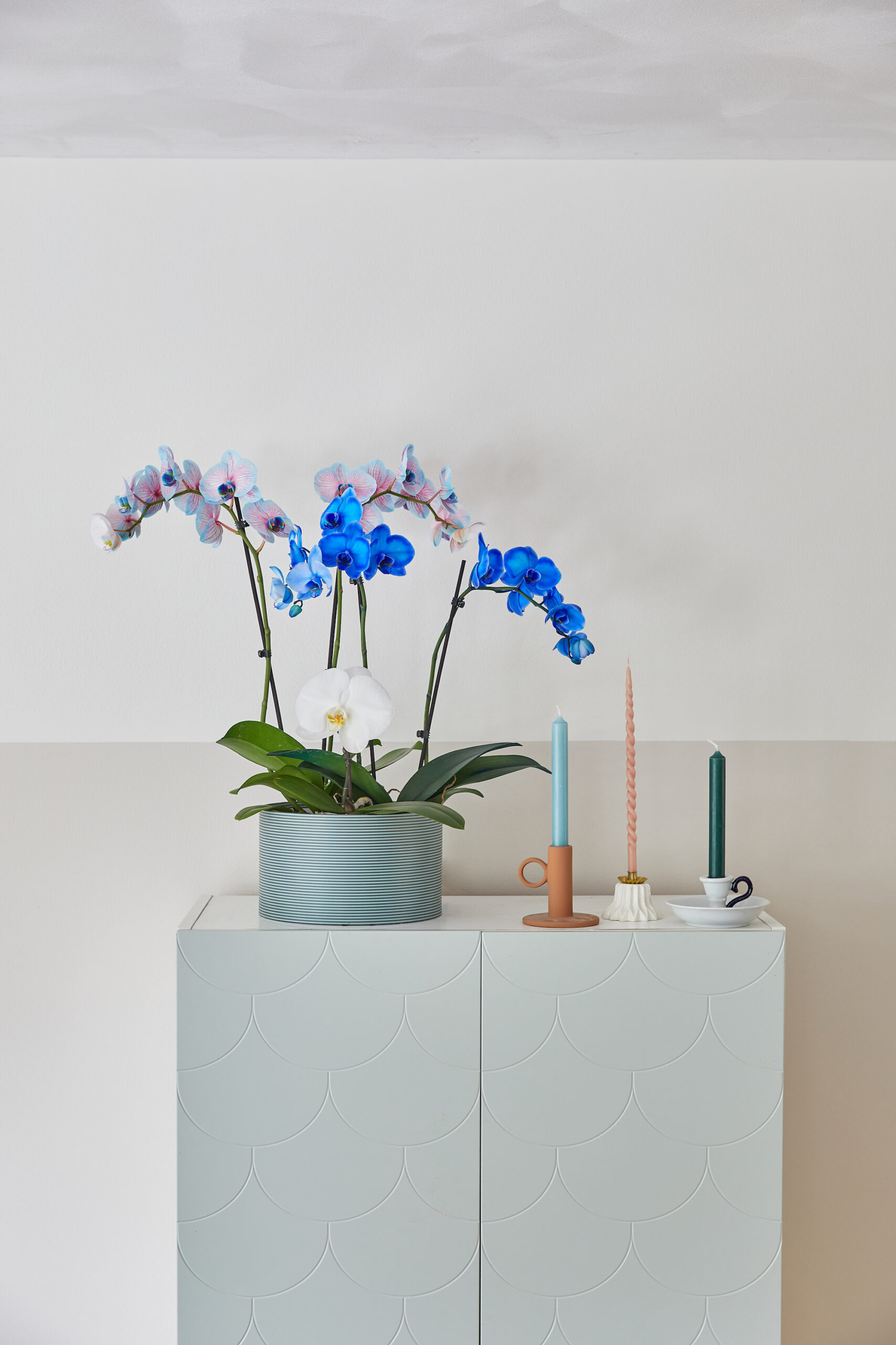
Het geheim van blauwe orchideeën


Also read: Interior, flower & plant style trends for 2024

Stay informed with monthly news, promotions and inspiration.